How to Add a New Page to the WordPress Navigation Menu
By SHARON HENDERSON
Navigation Menu creation, and editing is a simple process in WordPress when you know what you’re doing. In this video, I walk you through the process for adding a new page to your WordPress navigation menu.
Watch the video or read the article below to discover how to add a new page to your WordPress navigation menu
Okay, time to focus on the purpose of this video. For the demo visuals, check out the video above.
The Demo site I’m using for the purposes of this demonstration has what we commonly refer to as a “hamburger” style navigation menu. You typically see this style of menu on a mobile device. In the video, I go ahead and change this to a standard desktop menu.

Switching to the Back End View
You can customise your website from the front end or the back end. At this point in the video, I switch to the back end. What’s clear, is that there are a lot of navigation menu items currently displayed here. I have the option to choose from lots of different menus and menu locations.
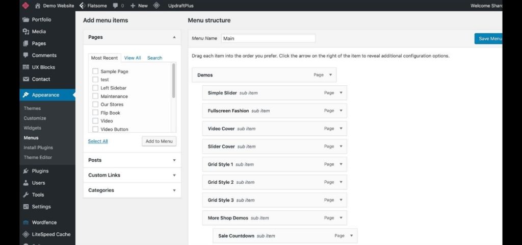
In the demonstration, you can see that there are lots of demo items displayed in the navigation menu. There are shop demos, business demos, shopping pages and much more besides. You can also see that there is a hierarchy to the menu items. On the front end, there are the main menu items. When you go ahead and click on them, they open up many sub-menu items in a dropdown menu.
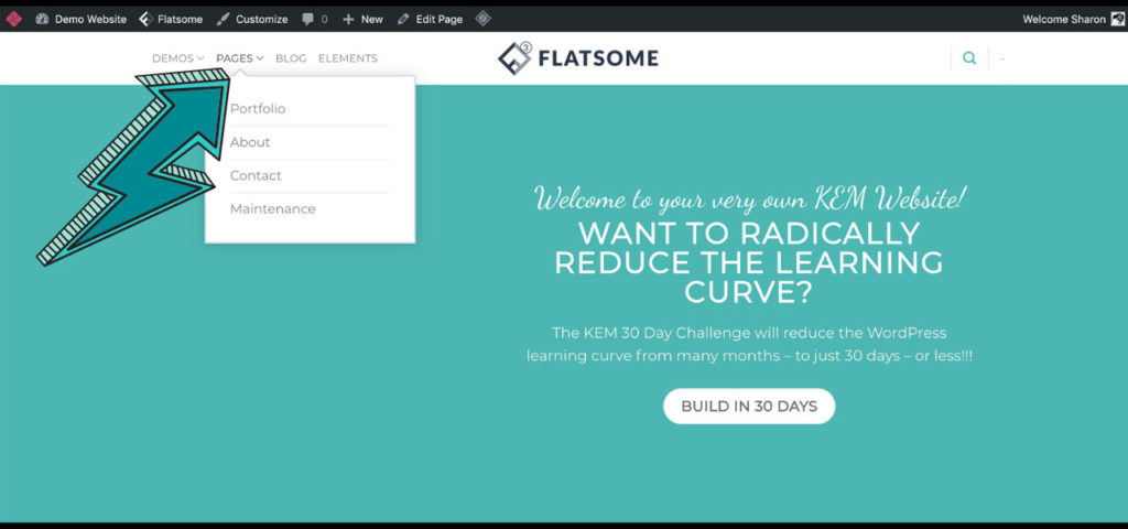
You can tell which items have sub-menus by virtue of the little down arrow that is displayed next to it. Below is a screenshot showing the dropdown menu arrow and the sub-menu items displayed when we click on it.
When this article was first written, Flatsome was the theme of choice. However, the Elementor Pro plugin coupled with the Hello theme by Elementor is my absolute go-to nowadays.

Live Customization Feature
There is an option to make the changes via the front end live customization feature. I love this feature, because it enables you to see exactly what you’re doing in real time.
How to Add a New Page to the Navigation Menu.
To add a new page to the Navigation Menu is pretty simple. All we have to do is go to our most recent pages. In the video, I demonstrate where you can view a list of recent pages. I can then click “Add to menu”. That selected recent page is added to the bottom of the list of menu items. I have reproduced this in the screenshot below.
If I want that page to be a submenu, I just have to drag it inwards to the right. That transforms it from a top level item, to a sub-menu item. I can also take an item anywhere. All I need to do is simply click and drag that item wherever I want it to go.

Option to Automatically Add Top-Level Pages to Menu
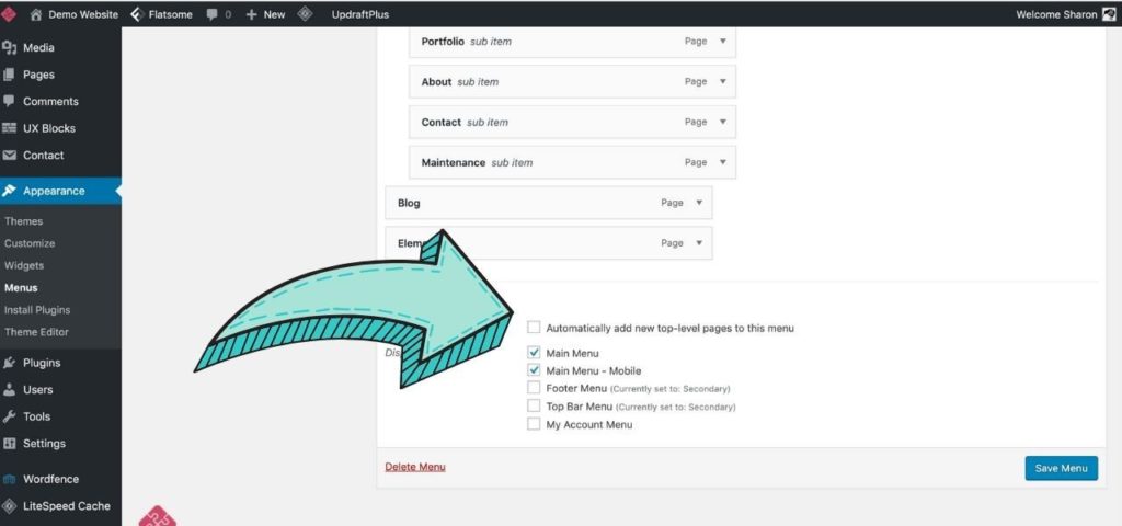
There’s also the option to automatically add all your top-level menu items to your menu. You can cimply check the “automatically add top-level items” check-box. This is shown in the screenshot below. But, personally, I’m not a fan of doing this. That’s because new pages are always automatically added to the bottom of the menu item list – in real time. And, oftentimes, this is simply not desirable.

When making edits to a live site, it is always advisable to do it in the following way. For the purposes of this demonstration, I am essentially editing a live site. And I strongly recommend you avoid doing this for sites that are operational and receiving visitors.
The safe and most professional way to make edits to a live site, is to first create a staging site. This is a duplicate copy of your website, where you can test your edits. When you’re ready, you can then push them through to the live site, confident that they will have the desired effect.
Maintenance Plugin Option
Not all hosting companies offer staging site functionality. However, my web hosting services do include this feature. If your host doesn’t offer staging sites, then I would recommend installing a maintenance plugin. Alternatively, you can switch over to a maintenance page. Then visitors will see a message on the front end to the effect that the site is currently undergoing routine maintenance.
Typically, you can customise the maintenance page and include your own branding too. This is a far better alternative to live editing. That’s because live editing has the potential to bring down your site. Or it could reduce the front end view to a page full of code and misaligned pages. Or, heaven forbid, the dreaded “white screen of death!”
Menu Locations
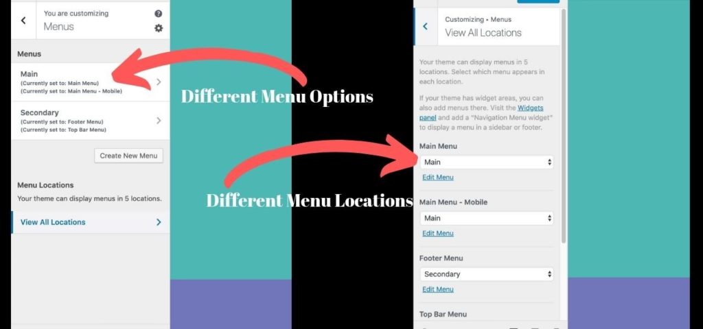
The Navigation Menu you see displayed in the screenshot from the video (below) in the existing Main Header is currently set to “Main Menu”. You have the option to choose where you want this particular menu to be displayed. There is the option to also display the existing Main Header menu in the mobile header too. That said, if it’s a menu containing many items, a shortened version might be necessary for display on mobile. Meaning that it’s often preferable to have a different menu displayed on mobile and desktop.

In the video, you can see the template that the footer menu uses now is different to what you have in the Main Header. You also have the ability to display more than one footer menu. Currently, we have our footer menu, which is currently set to the secondary menu. There is also the ability to display a top bar menu. However, none is currently set to display in the demo site we see on the video.
If I wish, I can create new menus and place them in different locations. With Flatsome, there is the ability to display a wide variety of different menus in many different locations. For example, I can have a “my account” menu, or I can set up a new menu for each location.
Making Pages Responsive
During the live, one of the viewers asked whether all pages are already responsive for all devices. Flatsome gives you the capability to customize according to the viewport the site is being viewed on. Depending on the layouts you use, it may be necessary to tweak your design so that it is responsive across the full range of devices. All good themes and page builders make this possible.
Should you Build First on Desktop, Tablet or Mobile?
Personally, I build websites on desktop first – unless a client’s target market is mobile users first and foremost. In this case, I would build my site for mobile first, and then make it responsive on the other viewports secondarily.
Thank you for tuning into this live. I hope you have found it helptul. If you have any questions, you can reach out through one of the social media platforms displayed in the footer, or head on over to the Contact page.
Share the love


